We design, develop, and deliver intelligent custom software solutions and digital products for SMEs, enterprises, and startups, harnessing cutting-edge technologies, such as AI, Big Data, and Machine Learning.
Explore NowOur data analytics services help industries integrate and analyze data utilizing artificial intelligence and advanced algorithms. Our data insights solutions help enterprises make informed decisions, optimize operations, and gain a competitive edge.
Explore NowUpgrade your legacy software infrastructure with our advanced application modernization services. Our solutions rapidly respond to new demands of business and market by upgrading their design, functionality, architecture, and technology stack.
Explore NowWe deliver custom AI solutions using emerging tech—ML models and natural language processing. Our expertise in chatbots, predictive analytics, image recognition make your product more intelligent, sustainable, and client-oriented.
Explore Now


We are Jellyfish Technologies, a pioneering digital product and software development company with a team of 150+ expert software developers, QA engineers, project managers, and business experts dedicated to crafting bespoke software products, applications, and operational systems for SMEs & enterprises. With 13+ years of expertise and a track record of successfully delivering 4000+ web, app, and software projects, we have established efficient processes that ensure the right results, on time, and within budget.
Years in Business
13+
We boast more than a decade of experience in the software development industry.
98%
All our projects are delivered on time while maintaining a commitment to excellence in quality.
Full-Time Experts
150+
We have highly experienced & skilled professionals to build your product.
Clients Return for Additional Projects
93%
Impressive client retention rate, underscoring our commitment to client satisfaction.
We specialize in software development and customized solutions, utilizing the latest technologies (blockchain, web3, ML, AI) and industry best practices to help businesses achieve their digital goals.
Unlock the potential of data through advanced visualization and our team of expert data analysts. Our data analytics services harness cutting-edge technology to extract actionable insights and customize solutions for your business’s success.
Our cloud engineering services facilitate the re-platforming, re-hosting, and re-engineering of applications, optimizing them for cloud environments. You can harness the power of the cloud to effectively address intricate business challenges.
Our application modernization services can breathe new life into your existing software, enhancing performance, security, and user experience. We’re committed to supporting you every step of the way on your application modernization journey.
Our AI services bring expertise and experience in natural language processing, machine learning, automated ML, generative AI, responsible AI, and more to help you deliver innovative solutions at scale.
With our DevOps services and solutions, we optimize workflows with automation and collaboration, ensuring efficient software delivery. Our certified DevOps experts incorporate best practices to enhance scalability and reliability in the ever-evolving tech landscape.
Over the past 13+ years, Jellyfish Technologies has worked with startups, agencies, and enterprises across the globe. Our dedicated and passion-driven work for our clients has earned us multiple awards & recognitions.


Explore a selection of our case studies to gain insight into our innovative approach and our ability to craft unconventional digital solutions tailored to our client’s specific needs.

Analyzed client’s operations and FM trends, and followed a structured dev process.
Conducted constructive user testing sessions during the development phase.
The work order and management feature was added to create, assign, and track.
Enhanced facility managers to oversee service providers and suppliers.
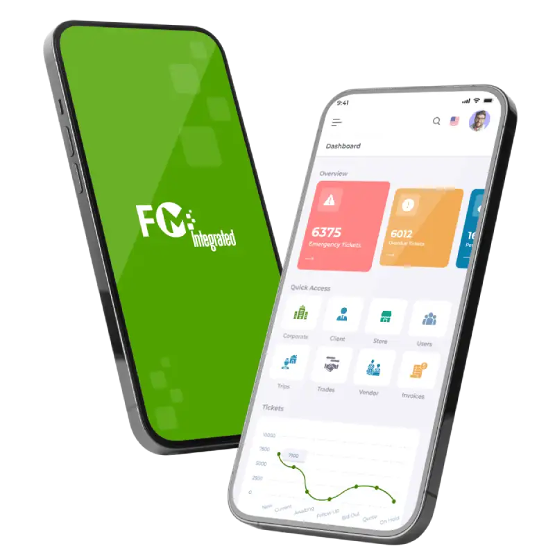
Integrated FM Group, a leading facility management provider, collaborated with Jellyfish Technologies to streamline operations. The developed platform integrates work orders, asset management, preventive maintenance, and vendor management, enhancing efficiency and reducing costs.

US

API integration module with configuration based approach.
XML transports diverse data formats in a flexible and readable structure.
The integration module has robust authorization mechanisms for secure data exchange.
Underwriting questions for risk assessment stored in XML databases for insurance standards.
Patra Corporation partnered with Jellyfish Technologies to develop a secure, web-based payment automation solution for premium finance in the insurance industry. The result improved task efficiency, reduced costs, and enhanced the overall user experience.

US

Code optimized for seamless handling of synchronous requests and high-volume traffic.
Integrated Google API, enhancing product functionality and connectivity.
Real-time updates for unstructured data were generated using MongoDB
Automated provisioning and de-provisioning users within Google Workspace
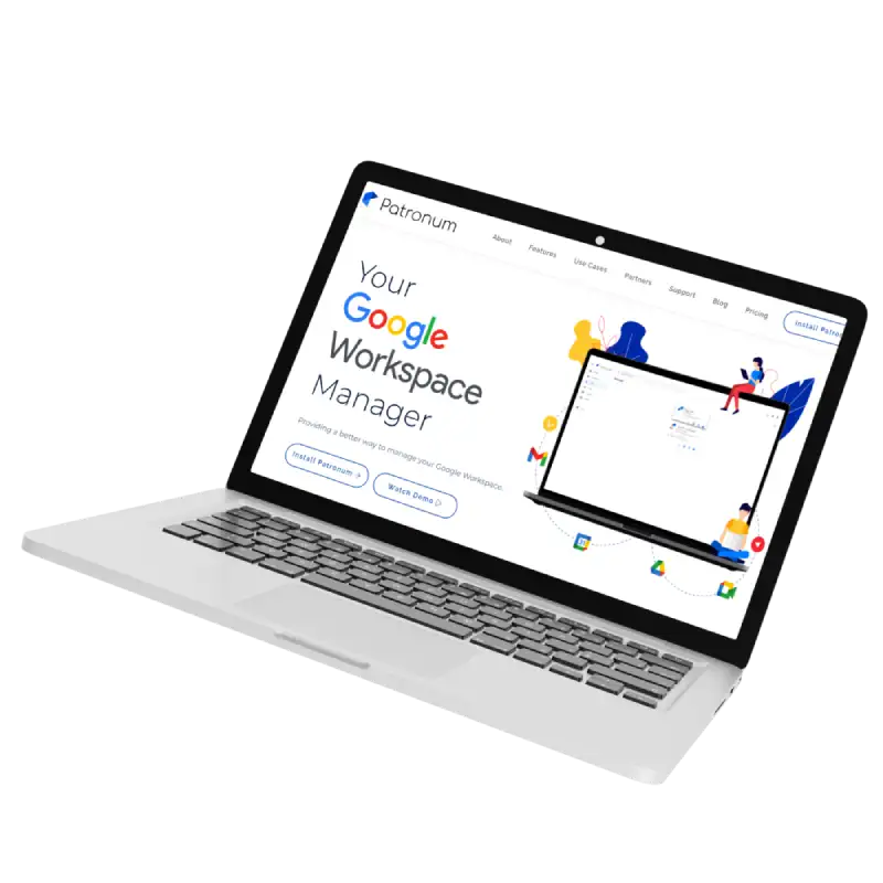
Jellyfish Technologies facilitated the launch of Patronum (Bespin Labs). The developed platform streamlines Google Workspace tasks, offering enhanced control over user files, efficient sharing, copying, and backup options, adding another satisfied client to our list.

US

With planning & research, evaluated app functionalities and architectural needs.
Developed a responsive UI with full accessibility, integrating Bootstrap design.
Top-notch user experience drove the design, resulting in a clean, intuitive UX.
App creates reports in CSV/PDF formats for data analysis and sharing.

US

Improved UI with enhanced design elements and navigation.
24/7 maintenance & support for uninterrupted system reliability.
Identified key features for mobile and web app performance enhancements.
We addressed bugs, refining existing features for improved functionality & UX.
Jellyfish Technologies collaborated with Builder Digital Solutions to create and deliver various visual marketing and engagement solutions for builders and new home buyers.

US
We serve a diverse range of industries, catering to a wide spectrum of fields and sectors.
Harness our software development services utilizing emerging technologies. From cloud-native to cross-platform solutions, we ensure seamless experiences and scalable solutions. Explore our technological expertise for innovation in progress.


With over 13+ years of experience in the software development industry, Jellyfish Technologies is a trusted choice, backed by a proven track record of successful projects.
Jellyfish Technologies provides a comprehensive one-stop solution, from cutting-edge software development to seamless integration and ongoing support, all under one roof, to fulfill your digital needs.
We are a trusted leader in software development outsourcing, delivering top-notch solutions to global clients with a proven track record of excellence in offshore software development services.
Our highly experienced, skilled software developers and experts can guarantee the top quality and usability of software, aligning it with the user’s needs.
Jellyfish Technologies offers a swift kick-off to a project, initiating development in 5 days or less, ensuring that our client’s digital aspirations become a reality at lightning speed.
Jellyfish boasts wide tech expertise, spanning diverse domains and technologies, enabling us to tackle complex projects and deliver innovative solutions for every client.
We are committed to delivering quality development solutions that surpass expectations, ensuring both innovative excellence and on-time delivery for every project.
“Not only would I hire them again without hesitation, but I will point out that after the first two test projects were done, they earned my repeat business and became the only contractors I worked with the whole time I was upgrading my site.”
KARL MARGRAIN
Founder and Managing Director
We believe in solving complex business challenges of the converging world, by using cutting-edge technologies.
© 2024 Jellyfish Technologies . All Rights Reserved.
We believe in solving complex business challenges of the converging world, by using cutting-edge technologies.